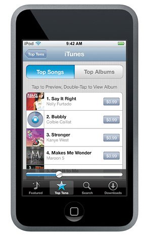
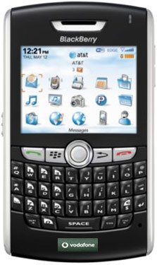
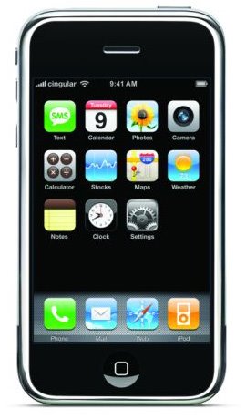
Facebook is revamping the mobile interface of the site, as the social network announced 250 million people use the site via their mobile phones. Instead of having several versions of the site for touchscreen phones, and non-touchscreen phones, Facebook will implement one single mobile site that adapts features available to users depending on the phone they use.
Facebook Product Designer Lee Byron wrote on the company's blog that running several versions of mobile sites was stifling the ability to innovate, because developers had to work on several code bases. So instead, they are launching a unified mobile site, eliminating the differences between touch.facebook.com and m.facebook.com.
"There will no longer be a difference between m.facebook.com and
touch.facebook.com, we'll automatically serve you the best version of the site for your device," Byron explains. "This way we can move even faster and build new features just once for every mobile device."
In the new m.facebook.com, touchscreen smartphone visitors will see Facebook's touch-friendly interface (previously of touch.facebook.com), which adapts on the phone's hardware capabilities. For example, a phone with no GPS will not see the Places Check-in feature. Feature phone users will see a scaled-down version of the mobile site, with an interface adapted for their screens.
To power the new mobile site, Facebook created a UI framework based on XHP, Javelin, and WURFL, a detailed database matching features available to device capabilities. 0.facebook.com, the text-only Facebook mobile site designed for speed, will also use the same framework.
"This enables us to very precisely target experiences and features to thousands of different devices," Byron writes. "For example, some devices don't have keyboards, or have limited means of navigating a page, tiny screens, or crippling browser bugs. We can customize our site in each case to deal with these issues and provide the best possible experience to everyone."


0 comments:
Post a Comment